FJob Access By Transit
![]() DEFINITION
DEFINITION
This indicator measures the percentage of our region’s jobs that a typical resident can get to in 60 minutes or less using forms of public transportation including buses and trains. It is an indicator of whether our transportation system supports economic growth.
OUR GRADE: F . A typical Baltimorean can only get 8.5% of the region’s jobs in under an hour using public transportation. This is slightly less than the 9% measured in the last report card and lower than the 11% in the 2015 Report Card. The Baltimore region is moving in the wrong direction when it comes to giving its residents better job access without requiring a car.
WHY IT MATTERS: This indicator tells us whether the region’s public transportation system is helping connect workers with employers. Many low-skill and mid-skill workers do not have a car, which cuts them off from many job opportunities. Businesses need reliable access to a larger labor pool to compete and grow.
WHO IS DOING IT BETTER? We believe that to earn an A, a regional transit system should provide access to at least 25% of a region’s jobs in 60 minutes or less. This is a high standard, and none of our peer regions have achieved it. Portland had the highest percentage at almost 14% of jobs accessible. But in Baltimore and almost all our peer regions, a typical resident can reach 100% of the region’s jobs by car in 60 minutes. If we can reach 4 out of 4 jobs by car, a standard of reaching just 1 out of every 4 jobs by transit should be achievable.
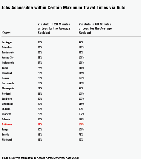
DJob Access By Car
![]() DEFINITION
This indicator measures the percentage of our region’s jobs that a typical resident can get to in 20 minutes or less by driving. It is an indicator of whether our transportation system supports economic growth.
DEFINITION
This indicator measures the percentage of our region’s jobs that a typical resident can get to in 20 minutes or less by driving. It is an indicator of whether our transportation system supports economic growth.
OUR GRADE D. People in the Baltimore region can, on average, only get to 18% of the region’s jobs by driving 20 minutes or less. In the 2017 Report Card, this indicator said residents could access 30% of jobs and we also assigned a “D.” The reason we kept the letter grade the same is that we adjusted the grading scale because the researchers at the University of Minnesota refined their methodology to the point where they recommended that previous reports not be compared to the new report. The methodology change resulted in all regions seeing similar declines in access.
WHY IT MATTERS Driving is the preferred option for many residents in the region to get to work. If a typical resident can reach more jobs in convenient driving times it is a sign that they experience choice and opportunity.
WHO IS DOING IT BETTER? In the Las Vegas region, a person can, on average, drive to 44% of the region’s jobs in 20 minutes or less.
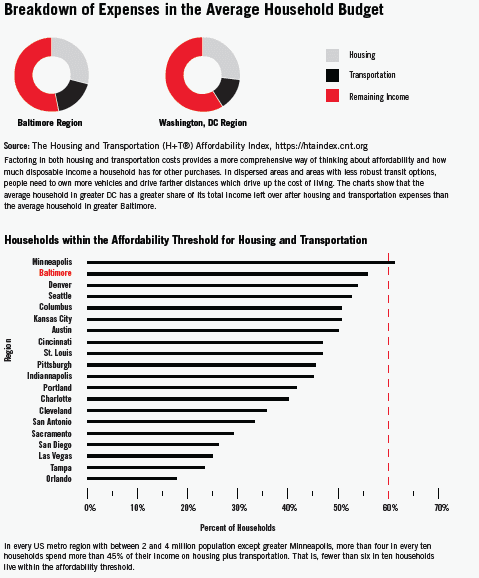
FAffordability
DEFINITION![]()
This indicator analyzes how many households in a metropolitan region spend more than 45 percent of their income on transportation and housing. It is an indicator of whether our transportation system supports economic growth. The Center for Neighborhood Technology has established 45 percent of household income as the affordability threshold for combined transportation and housing expenses.
OUR GRADE
F. In the Baltimore region, 55% of households exceed the affordability standard, down 3 percentage points from 2015.
WHY IT MATTERS
For most U.S. households transportation is the number two largest expenditure after housing. In some cases household savings due to lower housing costs are offset by higher transportation costs, and vice versa. Spending less on housing and transportation means more money in your pocket, and that buying power supports local business and strengthens the economy.
WHO IS DOING IT BETTER?
Although all of our peer regions receive an “F” for this indicator, Baltimore ranks second with the lowest percentage of residents spending above the affordability threshold. In the Greater Washington DC region, only 35% of households exceed the housing plus transportation affordability threshold.
CState Of Good Repair
![]() DEFINITION This indicator averages the grades that a state receives from the American Society of Civil Engineers (ASCE) for roads, bridges, and transit. It is an indicator of whether our transportation system supports economic growth.
DEFINITION This indicator averages the grades that a state receives from the American Society of Civil Engineers (ASCE) for roads, bridges, and transit. It is an indicator of whether our transportation system supports economic growth.
OUR GRADE
C:
ASCE has not published new data for Maryland (or many other peer regions) since 2020, so our grade remains the same. Roads and Bridges scored a C and B, and Transit scored a D+. In ASCE’s 2020 analysis, ASCE concluded “Although Maryland continues to embark on planning efforts for transit system improvements and expansion, the eight-year constant decline in ridership is indicative of systemic issues. Such challenges are further complicated by significant budget shortfalls (for MDOT MTA and WMATA) to achieve a state of good repair and improve on-time goals across all modes.”
WHY IT MATTERS
If transportation infrastructure is not well maintained, it impacts reliability and hurts drivers and transit riders. As a recent example of MTA’s poor state of good repair, in 2023, in its annual conditions report to Baltimore City government, MTA indicated that its Metro Subway rail cars scored a 2.10 on a scale of 1 -5, with 1.0 being poor and 2.0 being marginal (that is at or beyond their useful life), and 3.0 being adequate. MTA is slated to replace all Metro subway cars within the next three years.
WHO IS DOING IT BETTER?
According to ASCE, Tampa, with a 2021 Roads grade of a C+, a Bridges grade of a B, and a Transit grade of a C, for an average of a C+ is doing better than most regions.
CCommute Mode
![]()
DEFINITION This indicator measures the percentage of commuters in the region who get to work by walking, biking, transit, or carpooling. It is an indicator of whether the transportation system gives you choices.
OUR GRADE
C. Only 15% of our regional population commutes by walking, biking, transit or carpooling.
WHY IT MATTERS
Driving is a convenient travel mode for many trips, including your commute to work. However, problems arise when driving is the only feasible way. High-performing transportation systems provide choice and opportunities for multi-modal transportation without forcing residents to use any one particular mode. We believe a 30% share of biking, walking, transit and carpooling is evidence of a robust multi-modal system.
WHO IS DOING IT BETTER?
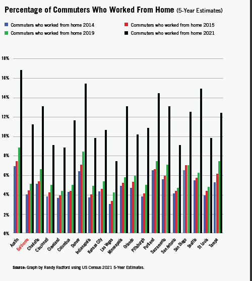
Of Baltimore’s peer regions, Seattle still offers the most choice. 22% of its commuters using alternatives to driving alone. Baltimore and all of its peer regions saw declines on this measure during the COVID-19 pandemic and corresponding increases in the percent of workers who work from home.
FDisconnected Communities
![]() DEFINITION
DEFINITION
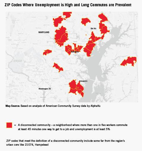
This indicator measures what percentage of a region’s workers commute at least 45 minutes one way to get to work. It is an indicator of whether our transportation system gives you choices or lets where you live determine your prospects in life.
OUR GRADE
F. In the Baltimore region 24% of workers spend 45 minutes or more commuting to work. In many cases the workers enduring long commutes to get to jobs are concentrated in certain neighborhoods.
WHY IT MATTERS
The Baltimore Neighborhood Indicators Alliance has found a strong correlation between neighborhoods where the highest percentage of workers commute at least 45 minutes and neighborhoods showing signs of distress including the highest levels of unemployment and poverty and the lowest life
expectancies.
WHO IS DOING IT BETTER?
Every similarly sized region in the country scores better than the Baltimore region on this measure. Seattle is just slightly better. From San Diego to Charlotte, Portland to Orlando, the percentage of workers in the other 18 peer regions who commute 45 minutes or more ranges between 10 and 18. At 24% Baltimore is an outlier on this key indicator of upward mobility.
CWalkability
 DEFINITION
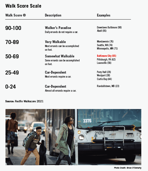
This indicator shows how easy and attractive it is to walk in a city. It uses scores given to each U.S. city by Walkscore.com which measures the number of destinations such as schools, parks, restaurants, grocery stores and other common destinations that are in close proximity to a residence and averages those scores across an entire city. It is an indicator of whether our transportation system gives us choices.
OUR GRADE
C. Baltimore, with a 2021 Walk Score of 64, is down one point since 2017’s Walk Score evaluation, but still ranks as Somewhat Walkable. While Downtown Baltimore’s Walkscore remains high (98), Baltimore’s citywide Walk Score continued to decline. One possible reason is Covid-19-related business closures. Another is more investment in some areas of the city and less investment or decline in others. In this way, some neighborhoods are a “Walker’s Paradise,” while others such as Curtis Bay (with few grocery stores or other amenities nearby) are “Car Dependent,” not necessarily by choice.
WHY IT MATTERS
In some places it’s easy to walk to buy milk or to get from the train station to your workplace. On the other hand, some places are built in a way that leaves driving as the only way to get around. Having more walkable places in the region gives you the option of doing some errands without needing to drive, promotes a healthy lifestyle, and leaves roadway capacity for other trips.
WHO IS DOING IT BETTER?
Seattle earns a higher Walk Score than Baltimore, but so did Minneapolis, which means that in these cities many errands can be accomplished on foot. Many of our peer cities (such as Pittsburgh) had lower Walk Scores than Baltimore in 2021, leading us to think that the pandemic played an outsized role.
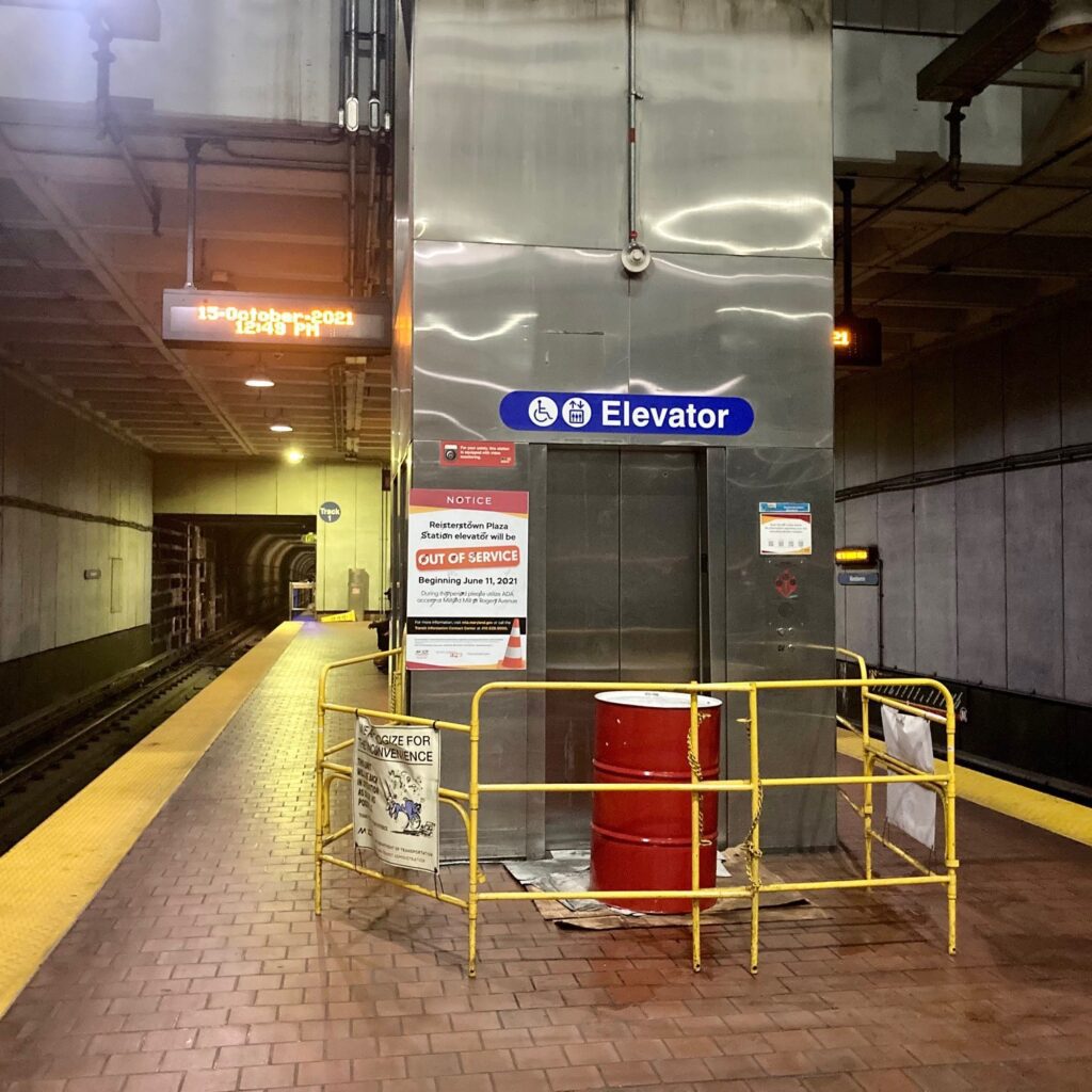
D+Reliable Transit
![]()
DEFINITION
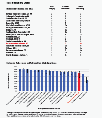
This indicator measures two things: data integrity is the percentage of a transit agency’s scheduled trips we observe in the real-time data; and schedule adherence is the percentage of observed trips that arrived at the bus stop or trains station on time. It is an indicator of whether the transportation system is giving you choices. (Transit Reliability has been one of the twelve indicators of a great transportation system since we created the Transportation Report Card in 2015. However, until 2023 we lacked the data to compare how reliable transit is in greater Baltimore versus in its peer regions. It has become possible because transit agencies almost universally publish real-time data that apps like Google Maps and The Transit App use to provide estimated arrival times. This year we contracted with Aries for Transit to compare the real-time data with published schedules to evaluate the reliability of the largest transit agencies in 19 metropolitan regions. We are issuing a separate report on that analysis with more on our methodology and findings. )
OUR GRADE
D+. The Baltimore region earns a D for Data Integrity because, from July through October 2023, only 80% of the bus and train trips printed on the Maryland Transit Administration’s schedules showed up in the real-time data – 20% either ran and failed to transmit a signal or did not run due to the lack of a driver or vehicle. It earns a C for Schedule Adherence because three out of four observed trips arrived at the bus stop or train station on time.
WHY IT MATTERS
Reliability tells us whether the system gets people to work, classes and appointments on time. For employers, an unreliable transit system affects employee turnover and productivity. In surveys people who ride transit say reliability is the most important aspect of service.
WHO IS DOING IT BETTER?Portland. Almost every bus or train trip in the TriMet schedule could be observed in the real-time data. And over 90 percent of observed trips arrived on time.
CAir Pollution
![]()
DEFINITION This indicator measures the number of times during 2016 when measured levels of ozone exceeded the U.S. Environmental Protection Agency’s (EPA) standard. It is an indicator of whether the transportation system is making you and your environment healthy.
OUR GRADE
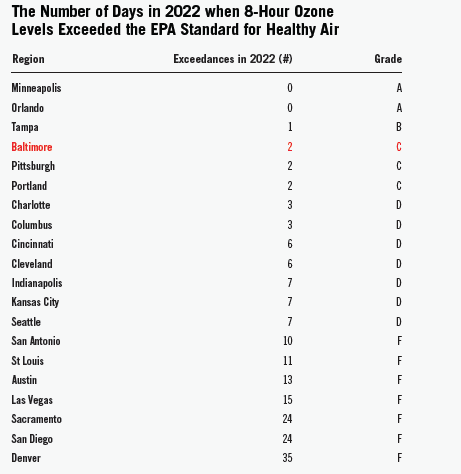
C. In the Baltimore region there were two days during 2022 when ozone levels exceeded the level that is healthy for humans to breathe. The Baltimore metropolitan region is a non-attainment area under the EPA’s standard for 8-hour ozone levels.
WHY IT MATTERS
Ozone is one of four pollutants the U.S. EPA lists as transportation-related. Ozone in the upper atmosphere is beneficial because it shields the earth from the sun’s ultraviolet radiation, but high concentrations of it at ground level are a major environmental and health concern. Emissions from cars, trucks, buses and other vehicles help cause ground-level ozone to form. Breathing ozone can scar your lung tissue, reduce your lung function, and trigger chest pain, coughing, and congestion. It can worsen asthma, bronchitis and emphysema. The EPA changed the standard in 2015 because the 2008 standard it had been using was found to not be adequately protective of public health.
WHO IS DOING IT BETTER?
Minneapolis and Orlando. Those peer regions experienced zero days during 2022 when the average ozone level in the air exceeded the EPA’s standard.
C+Physical Activity
![]() DEFINITION
DEFINITION
This indicator measures the percent of a region’s population that participated in physical activity during the past month. It is based on the Centers for Disease Control and Prevention’s Behavioral Risk Factor Surveillance System Survey. It is an indicator of whether our transportation system is keeping you and your environment healthy.
OUR GRADE
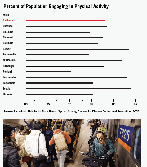
C. In the Baltimore region, 78% of adults reported participating in physical activity in the previous month. Lack of physical activity is also a contributing factor in the prevalence of obesity, which affects 31% of our region’s population.
WHY IT MATTERS
Physical activity can significantly reduce people’s risk of chronic diseases and is associated with improved quality of life, emotional well-being, and positive mental health. Transportation infrastructure and policies can positively impact physical activity levels by encouraging bicycling and walking. Additionally, people are more likely to walk when they use public transportation, and the lack of an adequate public transit system may mean that opportunities for physical activity are lost.
WHO IS DOING IT BETTER?
Some cities are doing a better job. Denver, Seattle, Austin, and Sacramento all scored above 80%. But Baltimore’s rates have improved five points since our 2020 report card evaluation, so we are making progress. Did the pandemic encourage more people to exercise? Did residents (who may have worked at home for all or part of 2021) have more time for physical activity? This is certainly possible.
CCommute Time
![]() DEFINITION
DEFINITION
This indicator measures the average number of minutes that commuters in the region spend getting to work. It is an indicator of whether our transportation system is keeping you and your environment healthy.
OUR GRADE
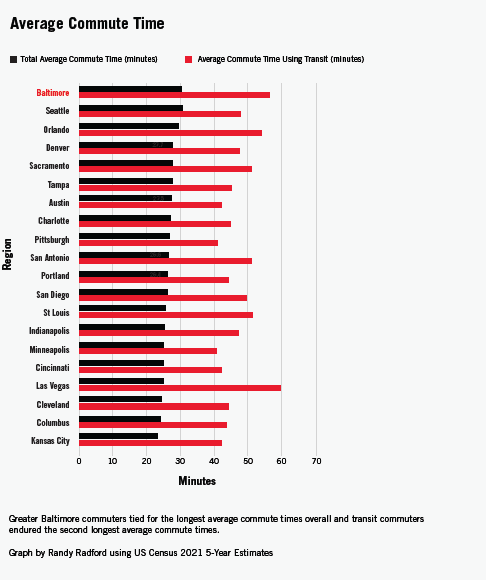
C. Compared to the previous report card, this region’s average commute time got better. We guess the cause is the increase in working from home, especially among federal employees who previously commuted to the Washington area. Nevertheless, at 28 minutes, we are tied for the worst average commute time among our peer metro areas. Transit riders suffer the most with an average commute time of 57 minutes, which continued to get longer.
WHY IT MATTERS
Longer commute times mean more time in sedentary positions (for those not biking or walking), more fuel consumption and more emissions. They mean less time for family or civic activities. Lack of physical activity is associated with obesity and numerous negative health outcomes. Longer commute times are bad for our bodies, our environment and our communities.
WHO IS DOING IT BETTER
Among our peer metro regions, all but Seattle are doing better, with the lowest average commute time being 23 minutes.
DSafety